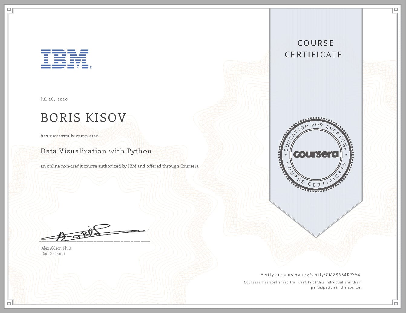
Data Visualization with Python
Data Visualization with Python – Certificate
IBM – Data Visualization with Python
About this Course
“A picture is worth a thousand words”. We are all familiar with this expression. It especially applies when trying to explain the insight obtained from the analysis of increasingly large datasets. Data visualization plays an essential role in the representation of both small and large-scale data.
One of the key skills of a data scientist is the ability to tell a compelling story, visualizing data and findings in an approachable and stimulating way. Learning how to leverage a software tool to visualize data will also enable you to extract information, better understand the data, and make more effective decisions. The main goal of this Data Visualization with Python course is to teach you how to take data that at first glance has little meaning and present that data in a form that makes sense to people. Various techniques have been developed for presenting data visually but in this course, we will be using several data visualization libraries in Python, namely Matplotlib, Seaborn, and Folium.
IBM
IBM offers a wide range of technology and consulting services; a broad portfolio of middleware for collaboration, predictive analytics, software development and systems management; and the world’s most advanced servers and supercomputers. Utilizing its business consulting, technology and R&D expertise, IBM helps clients become “smarter” as the planet becomes more digitally interconnected. IBM invests more than $6 billion a year in R&D, just completing its 21st year of patent leadership. IBM Research has received recognition beyond any commercial technology research organization and is home to 5 Nobel Laureates, 9 US National Medals of Technology, 5 US National Medals of Science, 6 Turing Awards, and 10 Inductees in US Inventors Hall of Fame.
Boris Kisov

Innovation, IT & Management
10+ years of initiating and delivering sustained results and effective change for companies across a wide range of industries including
innovation, enterprise software, digital marketing, start-ups, advertising technology, e-commerce and government.